Logo Design

Trying to make a logo for this blog was a bit hard because no imagery represents it. Since I love the color yellow and since it’s displayed throughout my blog I decided to use imagery that is yellow when making the three logos. The three logos contrast with each other through text and color. My favorite one I made was the bee, so I’m going to use it as my blogs final logo.

Lululemon Product Review

4 Styles:

Flow Y Bra Nulu

Wunder Under High-Rise Tight 28″ Full-On Luxtreme

Stripe In Stride Long Sleeve

Speed Up Short  2.5″

All four of these styles are simple and fit the Spring/Summer look highlighted in the trend research we did on the last blog post. Since Lululemon does a lot of solid color with their clothing, I want to update their basic styles by adding a pattern. For the “ Flow Y Bra Nulu” sports bra I would add pattern to the whole thing for a more bold look. Next for the “Wunder Under High-Rise Tight 28″ Full-On Luxtreme” leggings I would aging make it all pattern except the seams to create a matching bra and legging set. For the “Stripe In Stride Long Sleeve” I would add pattern to the main portion of it and keep the mesh solid along with the seams. My idea for the “Speed Up Short  2.5″” is to do a mix of pattern and solids and maybe try a patchwork looked motioned in my trend research.

Trend Research

The theme the caught my eyes for spring/summer 2020 was “Empower Up”. With this theme in mind colors that will emerge are slightly darker pastels with a 1980s vibe. Patterns that will appear will tend to be gender-neutral and have a technologic or very raw look. New textile trends like industrial knits, Silks and satins, mesh, lightweights and so on will be introduced. The activewear brand I picked is Lululemon. Lululemon is best known for their workout sets that have serval function for example for running or biking. Lululemon has a very versatile brand I feel like any of the 2020 trends would work for the brand.

Trends that align- Empower Up

-I like the use of bold and fun pastel colors in this trend, and I think that it would be fun to incorporate it into my designs. Since activewear is no longer just something people workout in introducing more bold colors in designs is something consumers want. -I like the idea of a Silks and satins look to activewear even if it has a pattern on it because it makes it look more fun and feminine. -Patchwork Denim was a theme that was touched upon in WGSN, and I have always been drawn to the patchwork look. Even if it’s not one of a kind, it still feels that way because so much is going on in one item of clothing. I haven’t seen any patchwork activewear sets, but I think it could be fun if the right colors and patterns are used.

Chosen Culture: India

For project 3 I have chosen to do the Indian culture. I decided on India because of how much I love the county. I lived in India for my last two years of high school and through my time spent there I got to see and experience real Indian culture.

5 New Things:
1) The Blue City of Jodhpur
2) Prints for Indian textiles are often made through handcrafted wood carvings
3) Hand weaving is common. India is known for its beautiful textiles.
4) India has 29 different states and 22 different major languages spoken therefore there is a lot of different types of cultures and people in India
5) Considerable religious influence in Indian culture even down to things like color. For example colors like orange have symbolic meaning in the Hindu religion. Vibrant color is very important to Indian culture.

Imagery:

Lululemon

The athleisure brand I have chosen is Lululemon because it’s the one I know best and wear most consistently. Lululemon is meant to be worn as workout clothing, but it has branched out and now makes all kinds of apparel, not just athletic wear. Even though not all the closes they make are for working-out, each garment stays on-brand by having a sporty look or feel. Nowadays people have gotten in the habit of wearing sports clothing in their everyday life and Lululemon is an excellent example of that. Just walking around campus, you can see tones of girls walking around in their Lululemon leggings even if they’re not going to the gym. People love Lululemon because it’s comfortable and still stylish, so it’s a win-win situation.

Practice Makes Perfect

Duck:
To take the duck photo I tiny bit further I added a third eye to the twin ducks like how we learned in class.

Sunflower:
When recreating the sunflower photo, I decided to add filters specifically the glowing edges on to give the illusion that not all the flowers in the garden were the same.

Palm Tree:
To personalize it I took the duck form the first edit and added it to the water in the photo.

Ranch House:
For the ranch house photo, I choose to make one of the pairs of boots into a flower pot by copying the sunflowers from the second edit in efforts to add something more to the photo

Observations

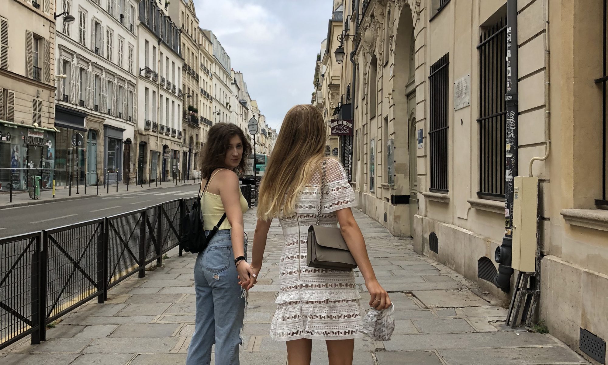
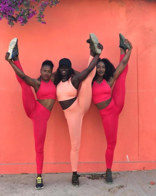
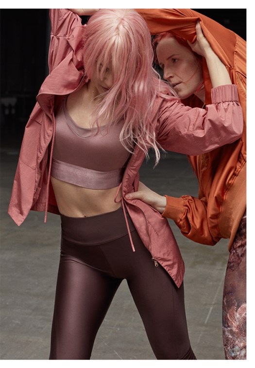
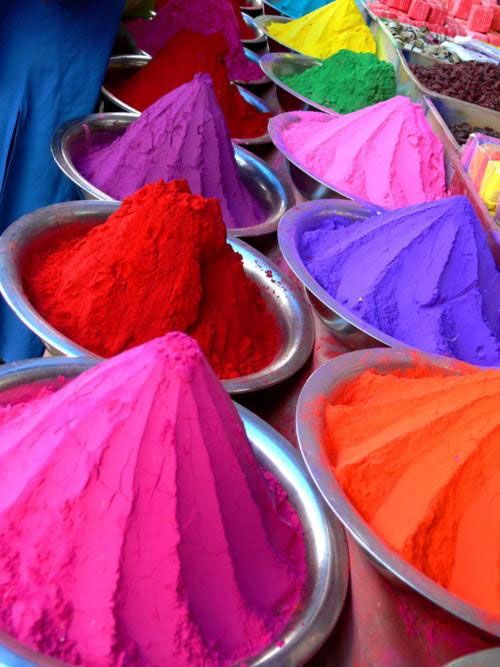
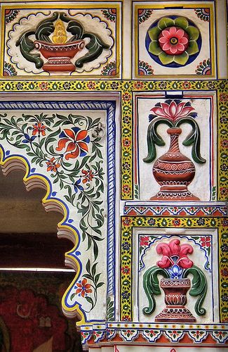
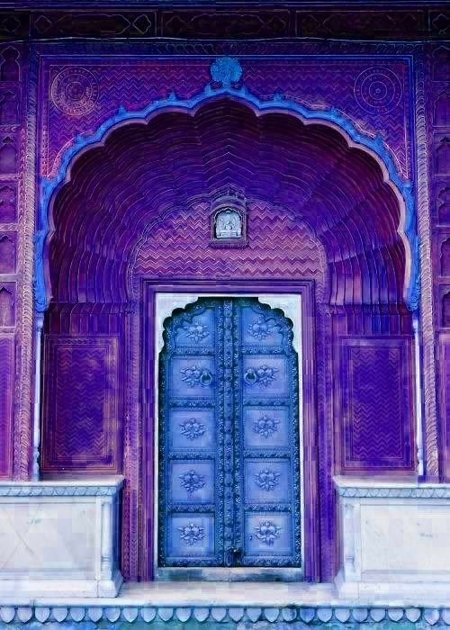
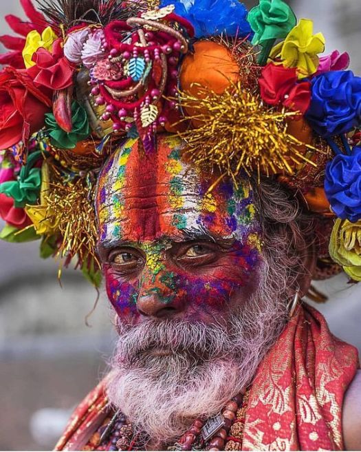
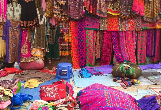
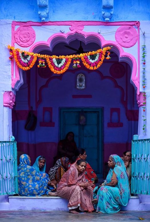
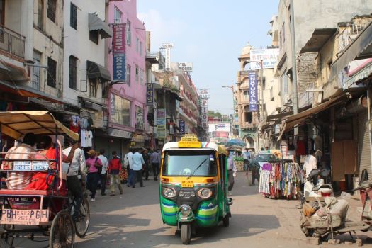
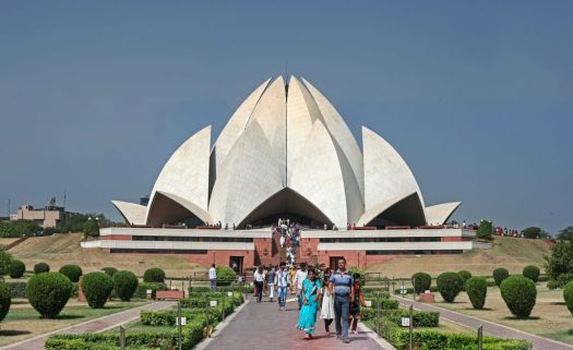
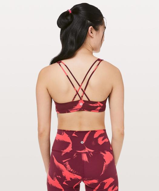
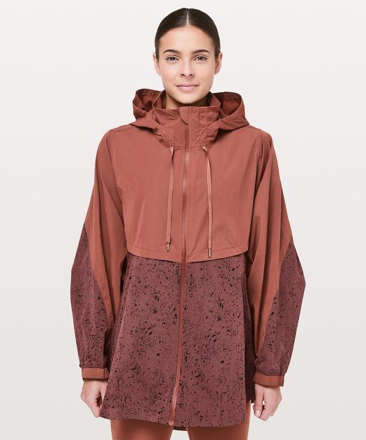
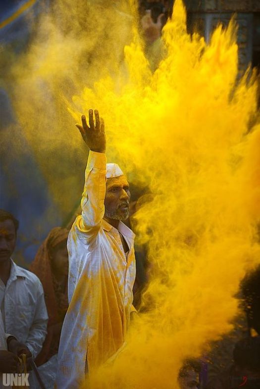
Walking around and observing VCU and the people on campus was interesting because you see patterns. The other day I was having lunch and people watching with my friend Kelly. Kelly, who goes to a different school kept pointing out students and saying, “that outfit is so VCU.” She told me that at her school everyone wears yoga pants and t-shirts to class every day.  There are people like that who go to VCU, but at the same time, a large amount of the students here are more outgoing with their fashion choices. Since I am so used to VCU and how things are, I don’t usually pay much attention because of it’s my norm. Just from minimal observations, you can tell that people who go to VCU are kind of hipster and rather bold with their fashion choices. At VCU you see lots of your stereotypical skater boys, kids vaping, brick buildings, cobblestone, street art, diversity and so on. Since I moved around a lot, I don’t have a hometown to compare VCU too. Before moving to Richmond, I lived in New Delhi, India and even though the two places are entirely different, I can still find some similarities between the two. Like Richmond, Delhi is a city full of amazing street art. There Is a large amount of diversity in Delhi or at least in the community I was a part of. The fashion in Delhi is nothing like Richmond’s because people dress more conservatively or in traditional clothing like saris. I love both places, but they appeal to me In different ways because they offer me different things.

Person, Place, Thing:
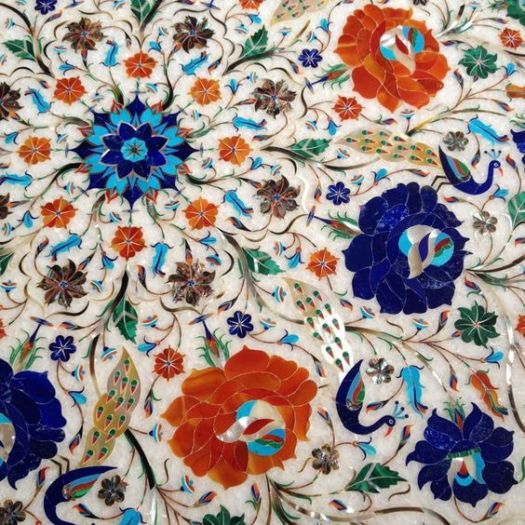
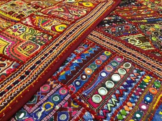
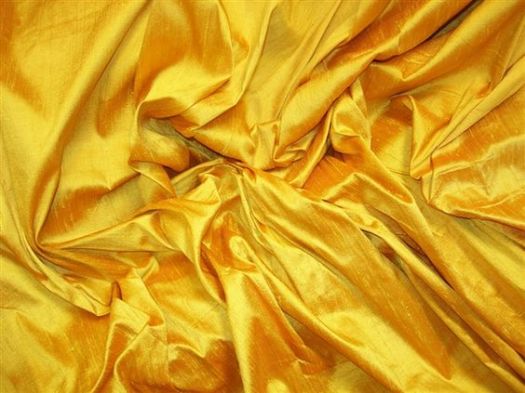
Texture:

Color Relationships: Yellow Monochromatic

I decided on a yellow monochromatic color relationship because of what the color yellow symbolizes. Yellow screams happiness and positivity things all people including me strive for.

Yellow is…

  • Warm
  • Happy
  • Bright
  • Inviting
  • Bold
Design a site like this with WordPress.com
Get started